
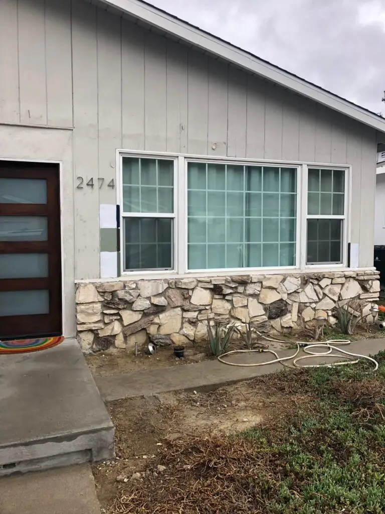


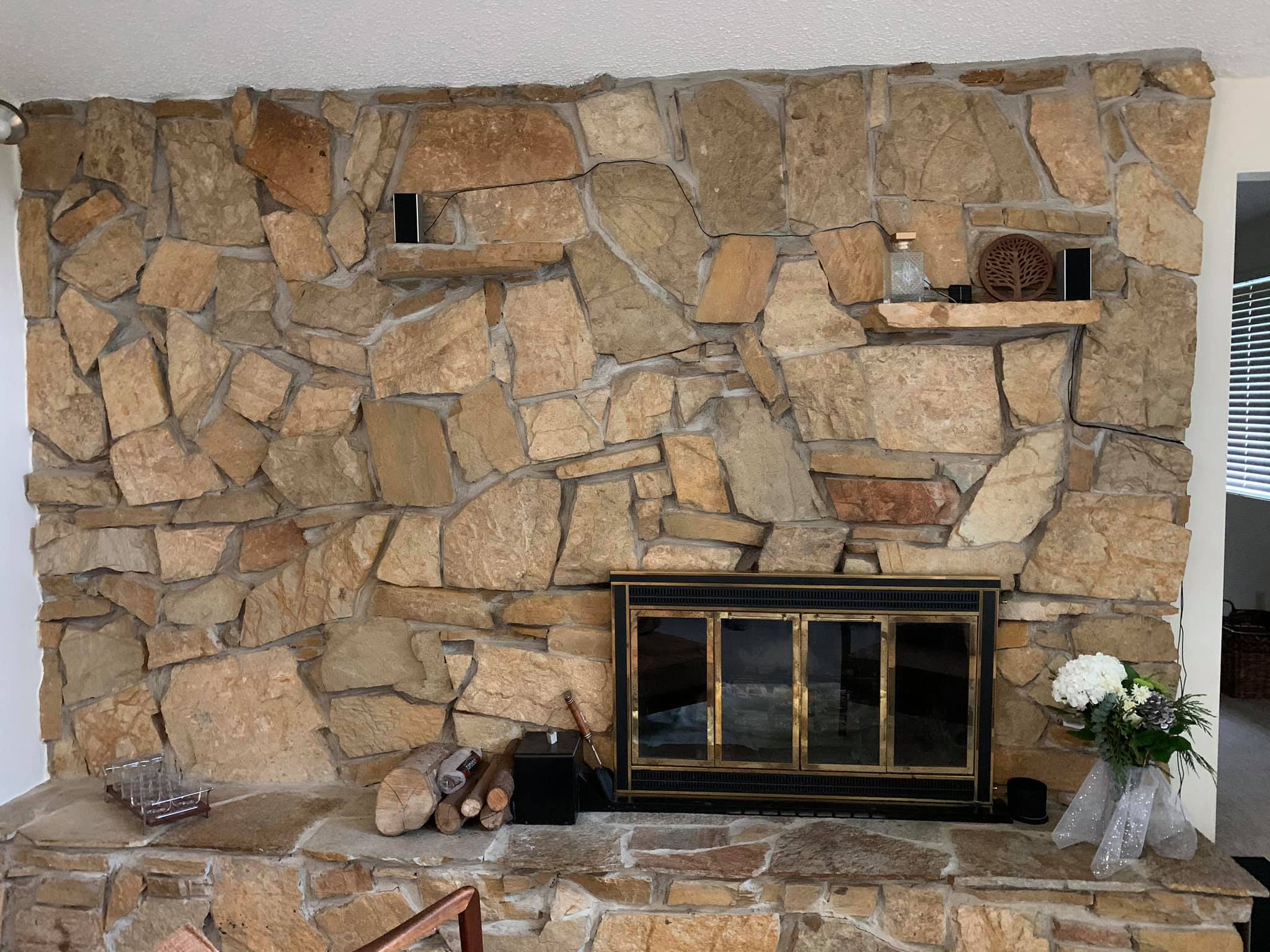
Our 1957 home is in dire need of exterior paint, and coming to a conclusion on colors that go well with the rock in the front has become something that I’m really worried about. A designer suggested a dark color scheme, but it feels so trendy and just… dark. If anyone has any input or special interest in colour, I’d love feedback. I’m open to anything and have been all over the color wheel.
It’s so much money to end up with something off.
Our facebook group had a lot of thoughts for this member. There were many great suggestions and comments and colour combination recommendations. Some thought that dark was fine, but the door should have a pop of colour. Some are not fans at all of the trendy dark look. We even had exterior colour consultants jumping in with their opinions.
Below, are a few of the thousands of tips that are shared in our exclusive Facebook Group dedicated to midcentury modern home owners. If you own a midcentury house and are not already a member, join us now!
- “Former exterior color consultant here. I’d go with a warm, medium taupe on the siding. Keep the wood door as is. Add an accent with some personality in that flat area around the door. I can’t tell if that extends to a large area like the garage? That would affect your choice. If painting windows, go 3-4 shades darker than the siding taupe. Your gut is right—that dark gray is too trendy and already kind of over IMHO.”
- “I do like the dark! But I think it depends a lot on exposure, your insulation/siding, and annual temperatures too. What if you did a white and wood palette?”
- “I used to be a house painter years ago and I’ve painted every house that I’ve ever lived in. My choice would be a taupe color. It’s kind of between light and dark and I think it would look good with the rocks. I think the popularity of light and dark colors swings back and forth, and so choose something that looks crisp and chic, and appeals to you.”
- “I’m also already tired of the trendy, not midcentury modern charcoal/black trend. I admit it can look really good. But if you like it, go for it. For your house I really don’t think the dark will look good against the stone. I’m not saying it in a personal taste “I don’t like it” way, but more rational – I don’t think it’ll balance well way. I might pursue the mid tones. (I’m an architect for what it’s worth.)”
Here are some further comments and pictures that our members shared for inspiration:
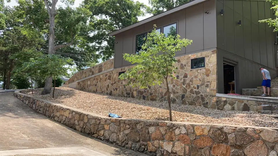
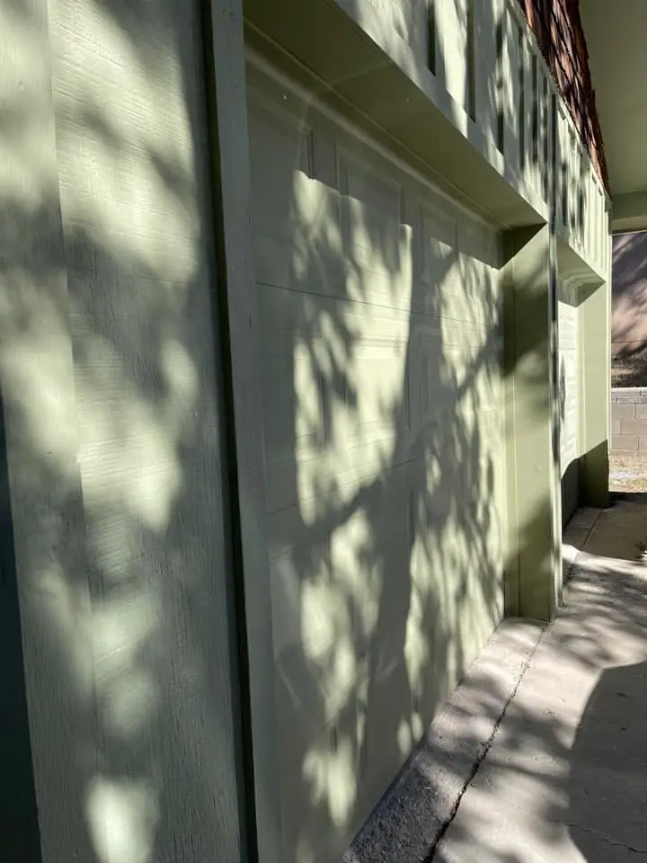
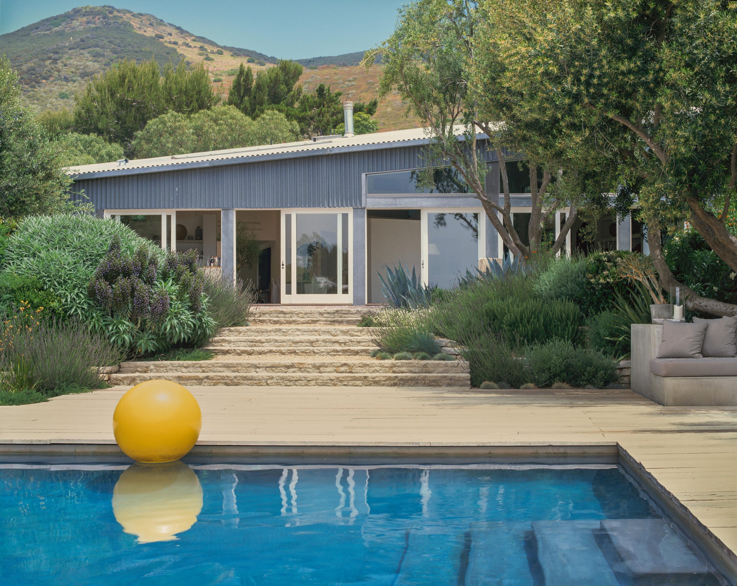
“I really like it with the stone wall and rock. I don’t feel it’s trendy at all. Won’t change it back to light, ever.”

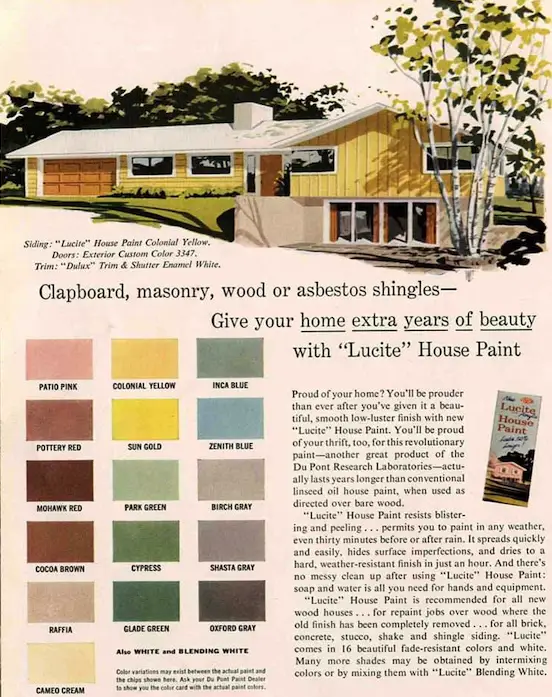
“Ugh. Please don’t do that! Check out these authentic colors for 1957! Go cherry not drab.”
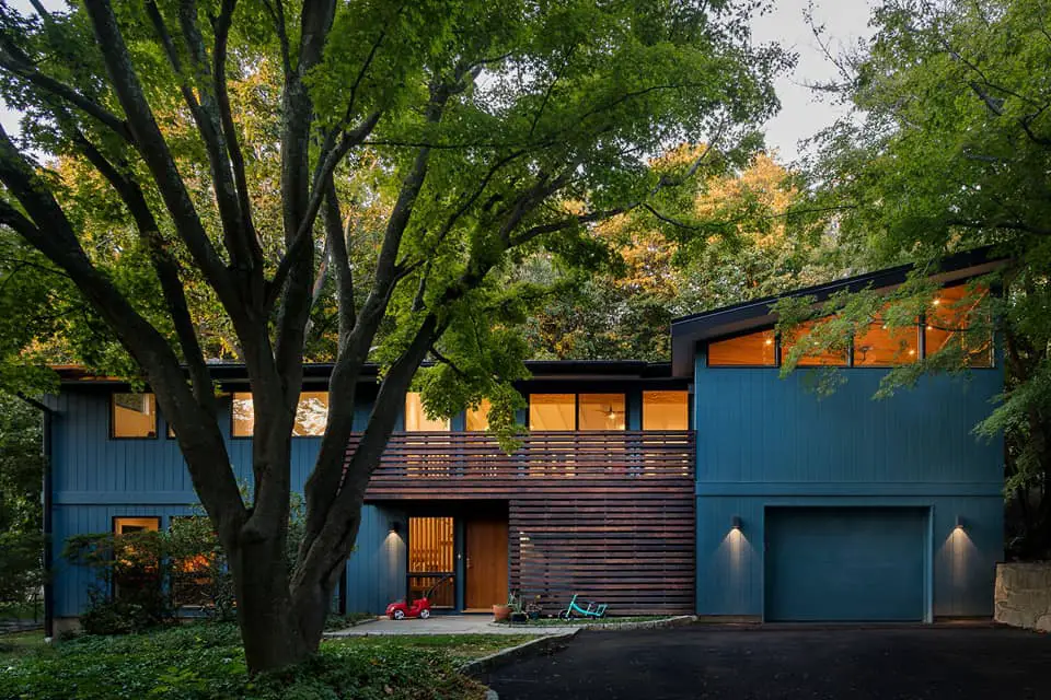
“Houses in the midcentury modern neighborhoods in our town have all turned dark grey and black! Not all but 80% I would say in recent years. Our house is a sage with red doors (it has been sage since 1960 I think!), I love natural wood for doors but maybe go for a color other than grey. A deep blue with wood door?”

“We love love how ours turned out. I wanted sort of moody without going full on dark.”
“This is our vacation house in Ruidoso, New Mexico, and while I would never have chosen this color (I bought it this way), I love it.”
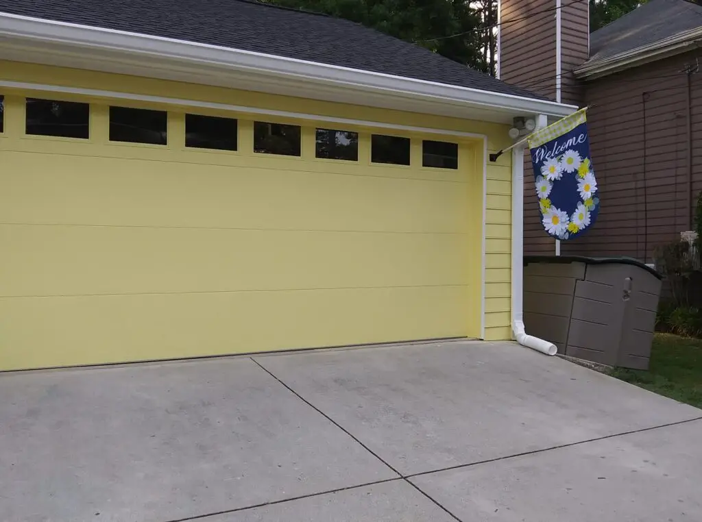
“I moved from my mid century home to a 1988 built two storey colonial. Long story about the move but my heart and colonial were also a big part of the mid century. As a consolation I painted my new house the perfect shade of yellow including the garage door, left the windows gutters underhand white and did the front door and porch rail in a bright navy. In a sea of gray and taupe homes the neighborhood feedback reinforces my sunny choice.”
You can read more tips about this topic here.


