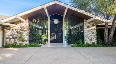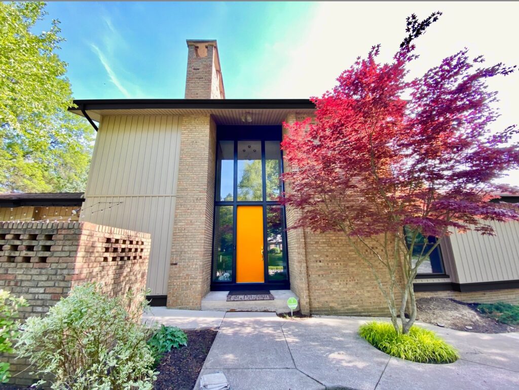
Pick my door color! Orange? Green? Pink? Purple? What do you think would look best?
Members of our facebook group for midcentury home owners were happy to help.
Below are some examples of members thoughts on the topic. These are only a few of the thousands of tips that are shared in our exclusive Facebook Group dedicated to midcentury modern home owners. If you own a midcentury house and are not already a member, join us now!
- “Match the trim or change to glass. This is a kitschy trend not a MCM design element.”
- “Chocolate brown. It’s bright enough to be an accent while not fighting with your beautiful brick color.“
- “Maroon. Something that picks up the Japanese maple and emphasizes the large scale opening in the masonry, interrupting the glass the least of any of the colors. It’s also nice with the brick color.”“
- “Orange. I love how it matches the Japanese maple tree. I did same for my home.”
- “There are some reddish bricks on the house, try to get the exact hue in the brick. That will be the ideal door color.”
- “Black as it causes the eye to look at the reflection.”
- “What is your color palette INSIDE?? Your door is an introduction to what awaits beyond… If the interior is still in flux, that’s OK. My least favorite is to match the trim/door. Missed opportunity.”
- “Yellow. Happy, exciting and inviting colors in the sunshine yellow family to welcome your family and guests with.”
- “The khaki tones in your brick don’t really go well with the blue or orange hues, but I do like the way red would complement your beautiful Japanese maple!”
You can read more tips about this topic and offer your own suggestions here.