
When you step into a 1940s bathroom, you immediately sense the tension of its time. These spaces were compact, often the only one in a modest family home, but they carried the optimism of a country shifting from war to peace. Efficiency still ruled—every square foot mattered—but within the limits of porcelain sinks and tiled walls, Americans found ways to introduce joy, often through color.
In the early years of the decade, shortages meant stark white spaces, practical and spare. By the war’s end, however, the bathroom was ready to bloom. Suburban houses sprouting across the country came with small but carefully considered bathrooms, places where new homeowners could afford to indulge in a little cheer. Tile companies and fixture makers seized the moment, offering hues that promised more than hygiene. They promised mood, atmosphere, a sense of the future.
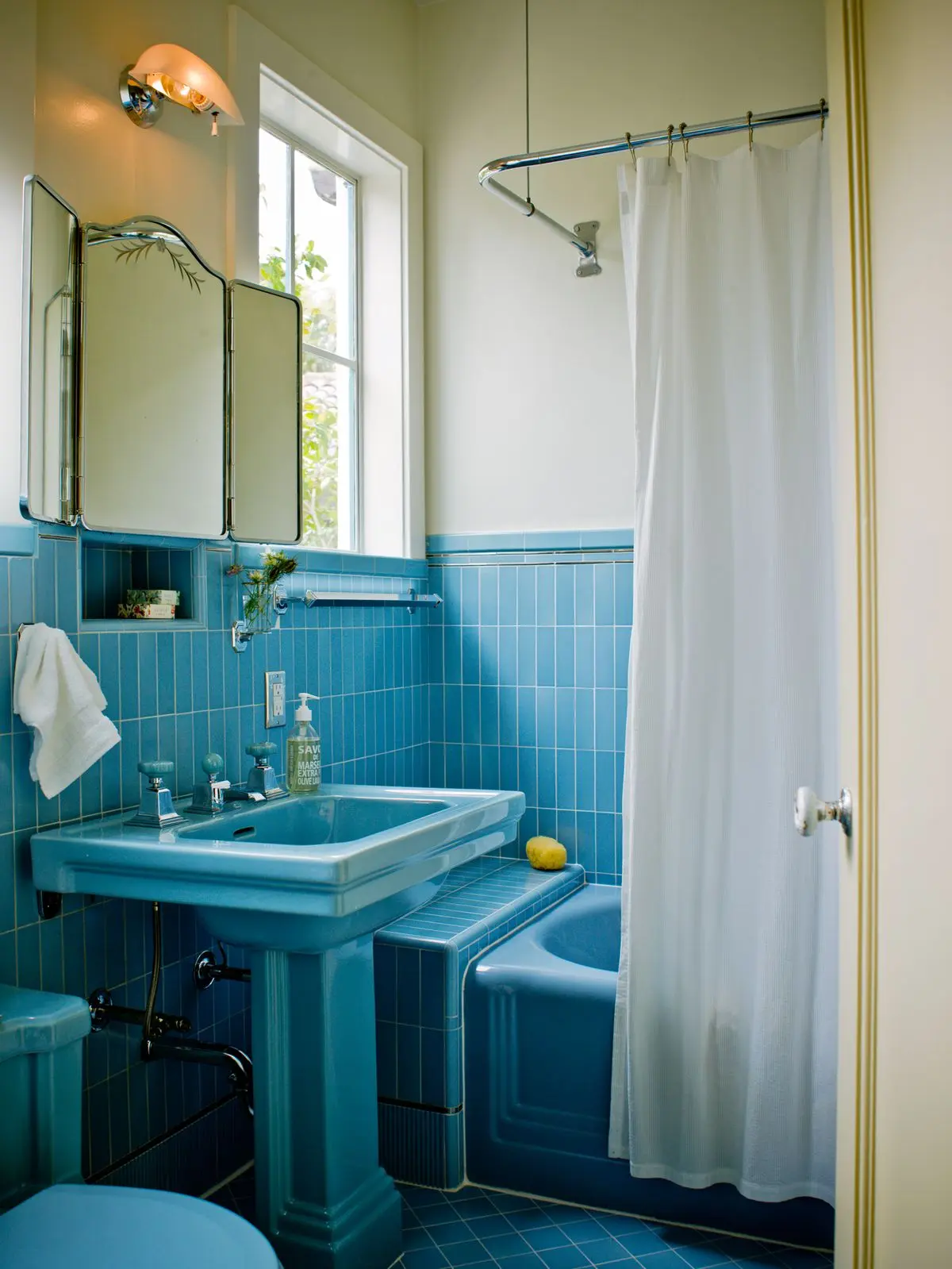
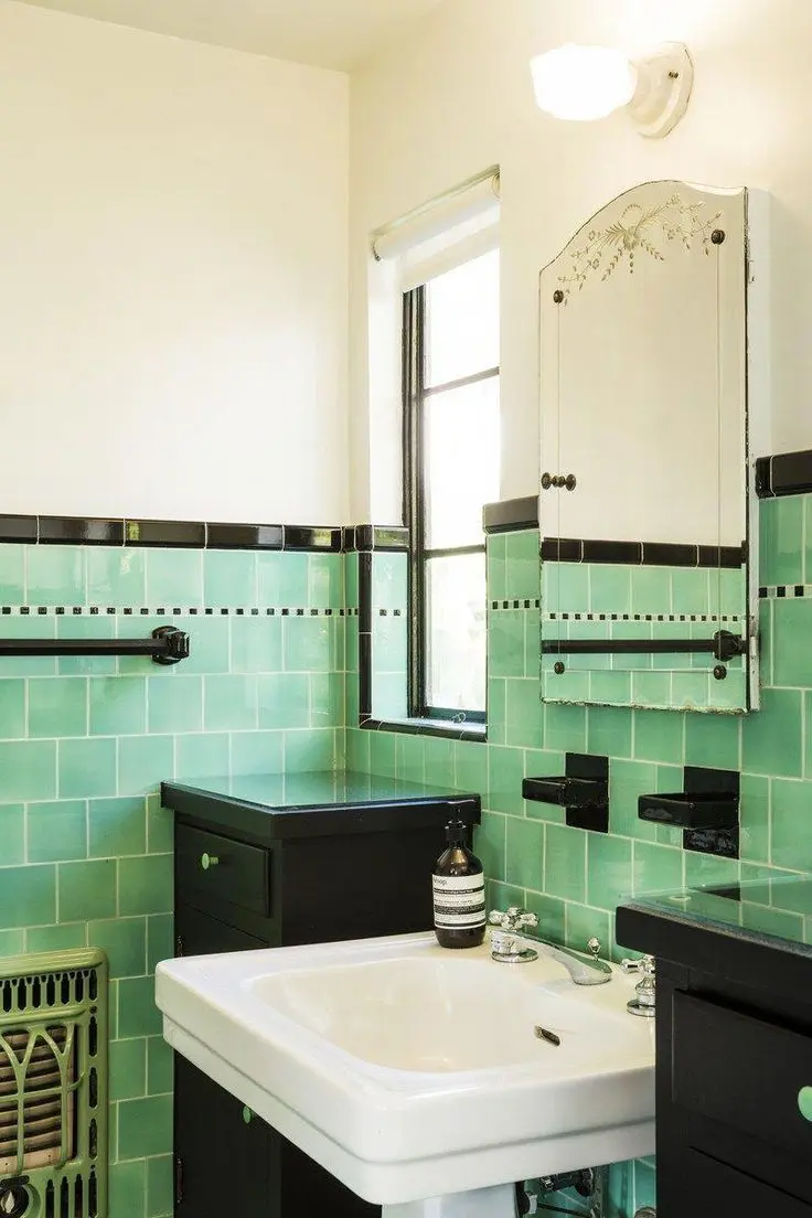
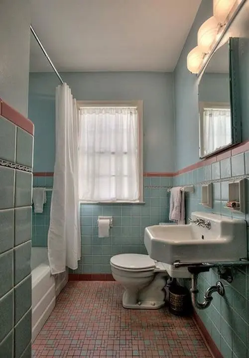
Porcelain sinks and tubs remained, their whiteness still equated with cleanliness, but they became the anchor for a new palette of pastels and accents. Walls glistened with 4×4 ceramic tiles in mint green or baby blue, sometimes capped with a thin stripe of black or burgundy to sharpen the edges.
Floors, once intricate mosaics, turned smooth with linoleum—checkerboard patterns in black and white spreading across tiny footprints with a sense of bold simplicity. Chrome taps and exposed pipes gleamed like jewellery against this backdrop, functional but decorative in their own right.

The most memorable impression, though, was color. Mint green offset by glossy black trim. Pale yellow made brighter with burgundy. Blush pink softened by creamy ivory. Even bolder mixes—pink with green, or three or four hues combined—found their way into late-1940s catalogues, reflecting the exuberance of a nation eager to decorate again. Hollywood added fuel, with glamorous powder-puff bathrooms on the silver screen setting aspirations that filtered into everyday homes. Even modest households could nod to these fantasies with a pink wall tile or floral curtain.
Why did these palettes resonate so deeply? After years of rationing, they felt like affordable luxuries. A pink tile band or mint mosaic rug could transform a small, utilitarian room into something hopeful, modern, personal. Manufacturers encouraged it, releasing new shades every year—colors that spoke of cleanliness, comfort, or quiet indulgence. Behind it all was the simple truth: color was the easiest way to bring personality into a room designed primarily for function.
Today, the charm of these palettes endures. In a world where bathrooms often lean toward neutral spa tones, a splash of 1940s pastel feels both nostalgic and refreshing. Imagine a shower lined in mint green subway tile, grounded with a slim black border; or a pale blush wall paired with brass taps for a modern twist on Hollywood Regency.
Checkerboard floors—whether in classic black and white or softened in blue and cream—bring instant character. Even a small accent, like a vintage-style mirror or towel rail, can echo the optimism of the period. The 1940s bathroom was never about luxury. It was about finding warmth and cheer within limits—making a small, efficient room feel generous through the play of color and surface.
That balance between modest practicality and lively optimism is what makes its palettes so enduring. Bring them forward today, and you carry with you not just a design style, but a reminder of resilience, ingenuity, and the enduring human desire to brighten the everyday.