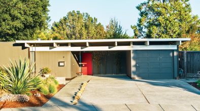
Even though I am used to show mid century modern houses decorated with natural textures and materials, the typical 50s and 60s houses often had rich and bold colours that helped to highlight, unify and divide the inner spaces.
The monotonous palette of the war period interiors were replaced by dazzling tints during the 50s.
Primary colours enlivened the interiors without making the rooms too busy or look cluttered, fully respecting the principles of the mid century modern interior architecture.
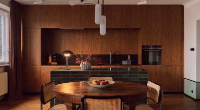
Monochrome colours could cover wide surfaces or being sparingly added, any way they never forced the sight to a wide range of ornamentation.
Bold colours also helped to avoid a sense of emptiness that the open spaces of -smaller but uncluttered- mid century modern homes might call to mind.

On the other hand, dark reds or deep greens were light moderators and suitable for the rooms with little or too much light.
Any way, the open space plan and abundance of light typical of the mid century modern architecture ensured that colours rarely looked oppressive.

The number and names of colours increased proportionally during the decade.
Despite the efforts of organizations to standardize colour names, new colours ranges were introduced faster than the interior decorators could record. Tones like blue-green and red-orange, for example, were given names such as sea green, leaf green, sunset and ginger.
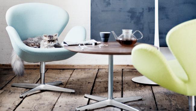
Within all the possible combinations, colour experts preferred the most light reflective ones. Blue and yellow -as an example- were often matched to maximize their potentials; the luminosity of yellow seems to increase when juxtaposed with blue.

The increasing popularity of abstract paintings made with shocking pastels, yellow ochres and deep primary colours helped to inject such colours in the interiors as well.
However, not all decorators opted for the sharpest and contrasting ones. Some preferred similar tints close to each others in the colour wheel; a designer tool where the colours were arranged in circle like the appear in the spectrum.
I have more to say about the predominant colours used in the mid century modern interiors so come back later this week to read more!
WOULD YOU USE A MID CENTURY MODERN COLOUR PALETTE FOR YOUR HOUSE? LET ME KNOW IN THE COMMENTS!

Thanks for reading and ciao.