
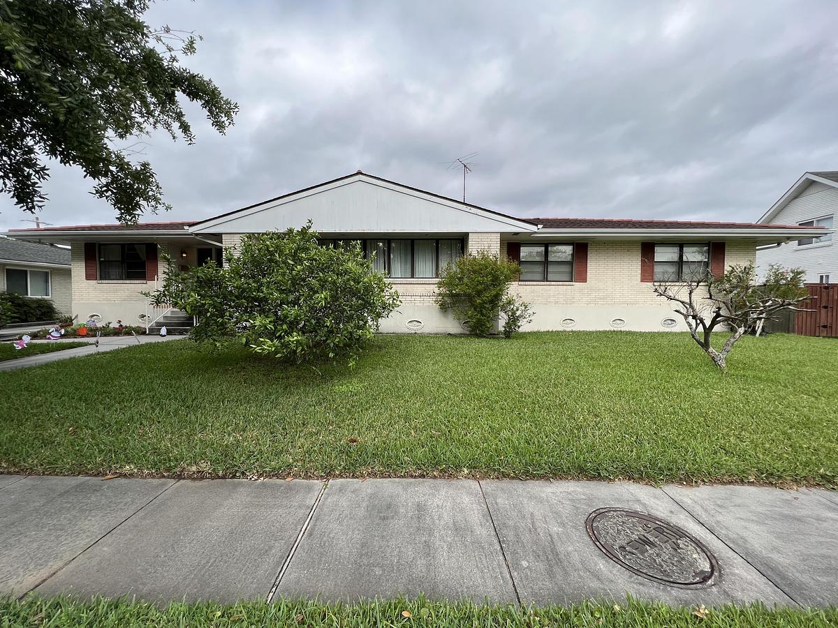

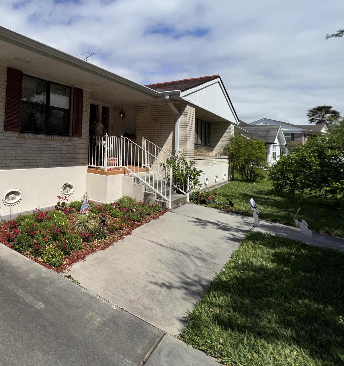
This mid-century home began as a typical example of its kind. Low ceilings and a series of enclosed rooms defined both its layout and its character. Each space had a fixed role, from study to dining room to sunroom, and circulation followed a clear, structured path. It was a house shaped by function and formality, reflecting the expectations of its time.
For the owners, the project was not only about space but about meaning. After years marked by change, the idea of permanence had taken time to settle. Although they had lived in the house for many years, it had not fully felt like home. Renovation became a way to stay connected to what they knew while reshaping the house to reflect a new sense of stability. Working with Nathan Fell Architecture, the process began with conversations that linked the owners’ past to their goals for the future.
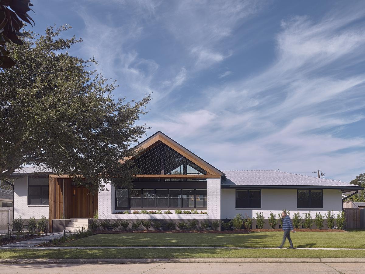
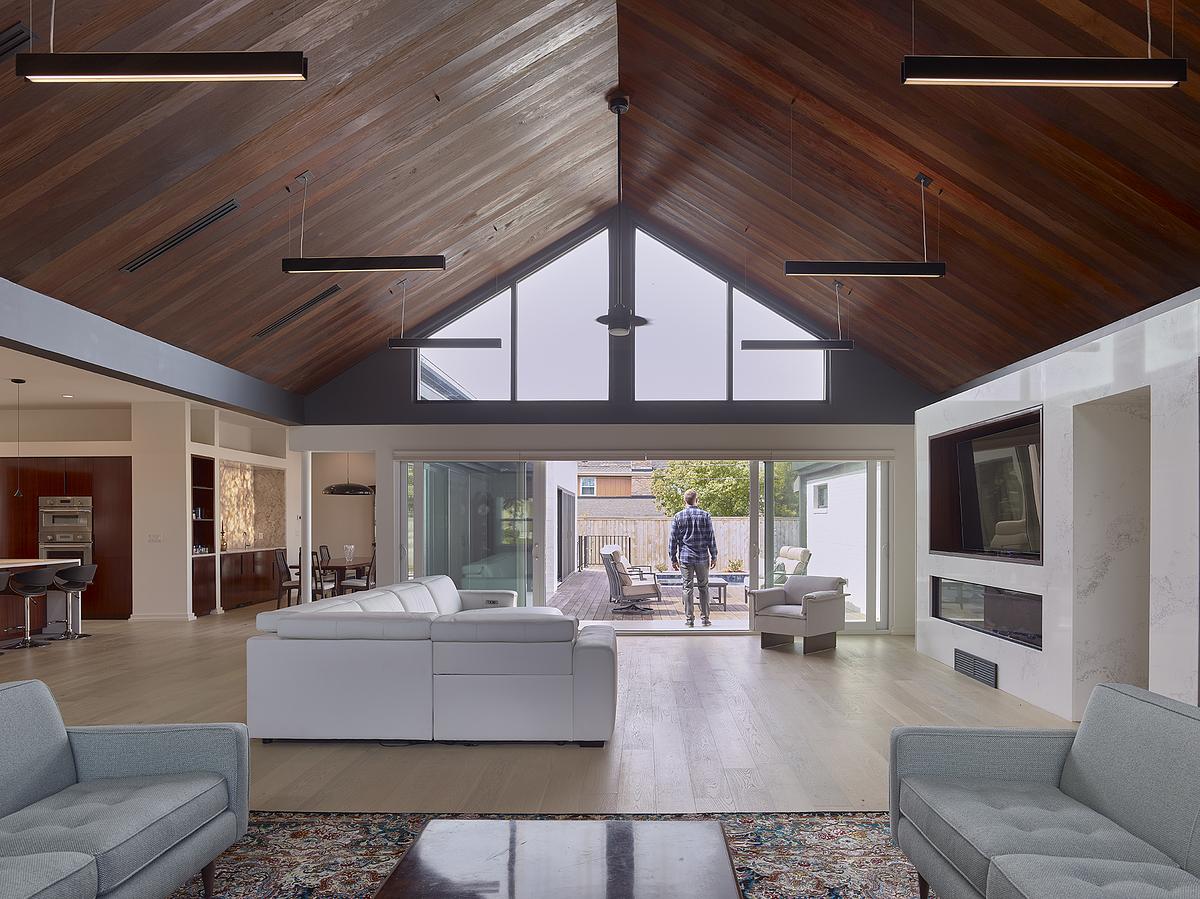
The existing plan was larger than it appeared, but the layout limited openness and visibility. Early in the process, the owners suggested raising the roof. This idea set the direction for the project. Rather than applying it across the entire house, the architects focused on the main living areas. Bedrooms remained largely unchanged, while the shared spaces were opened up to create a stronger impact.
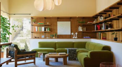
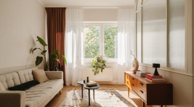
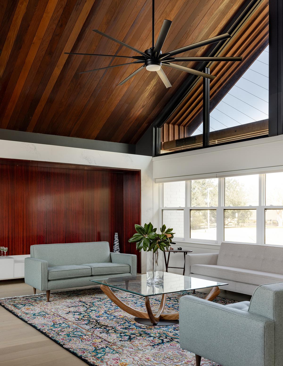
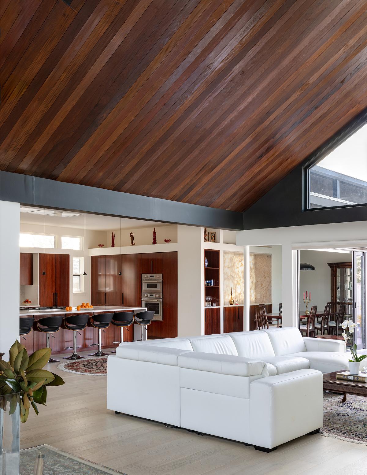
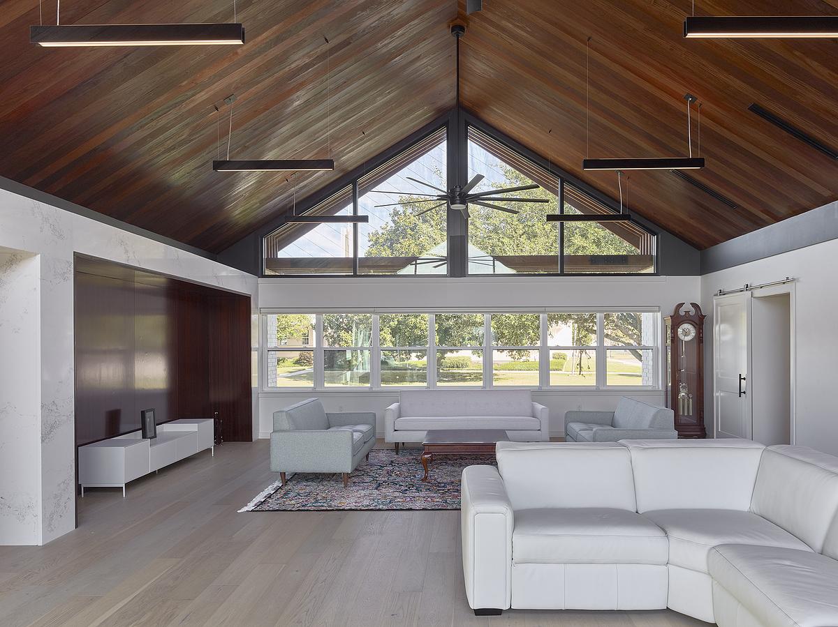
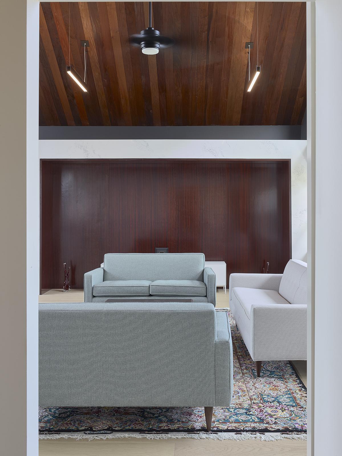
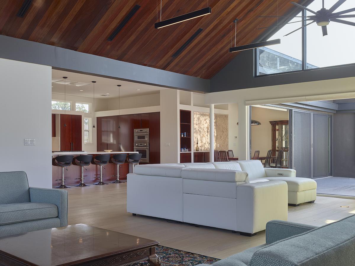
The central move was the expansion of a vaulted volume that now runs from front to back. The existing living room, which already had some height, was extended into the former dining room. Together, they form a single space that connects both ends of the house. Large triangular windows at each side bring in light and frame views, reinforcing the sense of depth.

This new living area allows for different uses and can adapt to the needs of a multi-generational family. At the same time, smaller and more private rooms were retained or introduced. A former playroom near the entrance was updated, and a new cabana room was created from the garage. Now, these spaces provide separation without interrupting the overall flow.
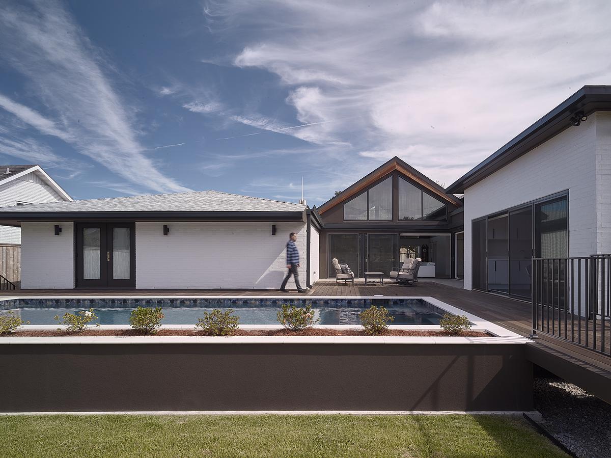
At the back, a two-sided sliding glass wall opens the living space to the garden. The pool was raised to align with the main floor, extending the interior level outward. The former deck now acts as a courtyard, offering views back into the house and linking different parts of the plan.
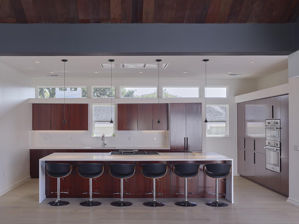
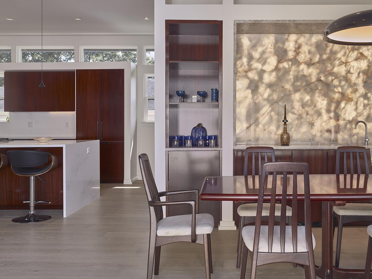
The kitchen also changed position within the layout. Previously enclosed, it is now part of the open plan, connected to both the courtyard and the main living space. The removal of the sunroom and informal dining area made room for a larger kitchen and dining zone that supports daily use and gatherings.
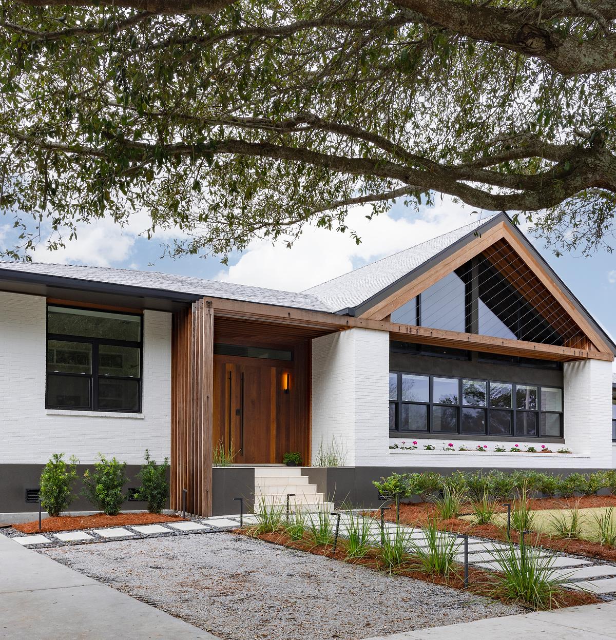
On the exterior, the changes are more restrained. The brick façade remains, maintaining a link to the original house and its surroundings. A wood trellis made of Ipe was added to the front, framing the gable and marking the entrance. It extends horizontally across the façade and leads to new double doors, giving the entry more presence. The trellis also reflects the changes inside, indicating the new scale of the living spaces while keeping the overall composition grounded.


