

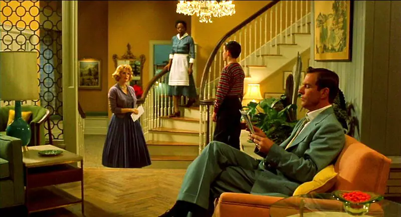
Todd Haynes’ Far from Heaven isn’t just set in the 1950s—it’s built on the visual language of the era. The set design doesn’t sit in the background. It functions as narrative. Mark Friedberg’s production design reconstructs a world defined by symmetry, polish, and restraint. Mid-century architecture and interiors do more than ground the film in time—they hold its emotional weight.
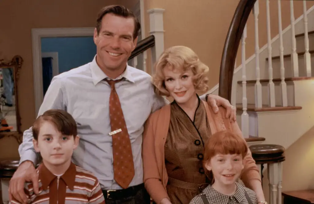
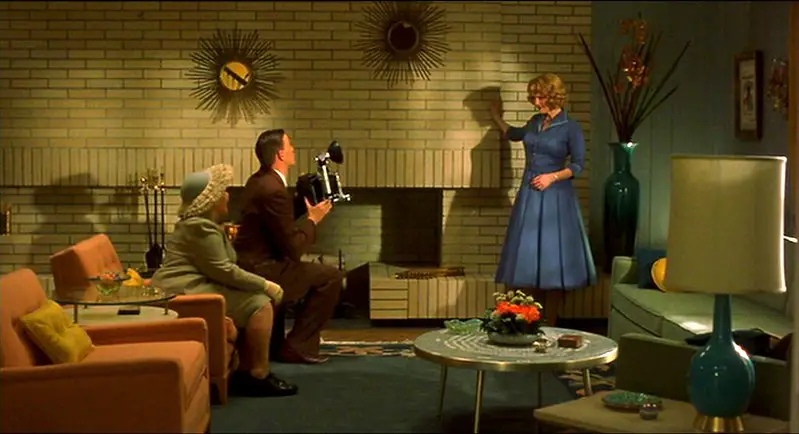
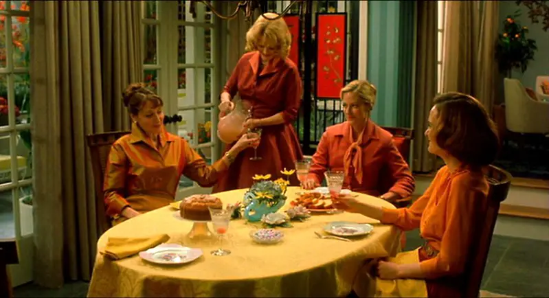
The story unfolds in a Connecticut suburb, the kind built on repetition and order. Cathy Whitaker (Julianne Moore) lives in a home that mirrors her social role: pristine, composed, and exact. The layout is open, but not inviting. Pastel appliances, floral drapes, and color-matched furnishings form a kind of visual script. Everything performs. Nothing flexes.
This aesthetic wasn’t chosen for nostalgia. The 1950s were a moment when design was ideological. Domestic modernism promised clarity and progress—an image of the future sold in magazines and showrooms. But in Far from Heaven, that same aesthetic becomes a mechanism of control. The openness of the floor plan becomes surveillance. The warmth of the palette gives way to cold light. The house doesn’t change. What changes is how it feels.
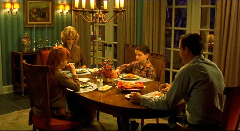
Haynes uses these interiors to reflect emotional tension. At the start of the film, the colors are warm—golds, soft oranges, touches of green. They signal comfort. But as Cathy’s life begins to fracture—through her husband’s secrets, and her connection with Raymond (Dennis Haysbert), her Black gardener—the tone shifts. Cool blues take over. Shadows lengthen. The Far from Heaven set design subtly tightens its grip.

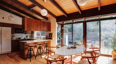
Contrast becomes the design’s strongest tool. Frank Whitaker (Dennis Quaid) moves through environments that are crisp and impersonal—his office is all hard edges and filtered light. There’s no softness. No room for contradiction. Raymond’s home, by contrast, is modest and textured. Less color-coordinated. More real. A space that makes room for silence, without enforcing it.
Friedberg’s attention to detail is precise. The furniture is authentic. The materials period-correct. But nothing feels fetishized. The set design in Far from Heaven doesn’t invite nostalgia. It invites scrutiny. The beauty is rigid. The surfaces are too smooth. The light is always curated. If there’s comfort, it’s structured. If there’s emotion, it’s deferred.
This is what makes the Far from Heaven set design so effective—it carries the story’s emotional architecture. It shows a culture more invested in appearance than in understanding. A time when form triumphed over feeling. And a style that masked exclusion with elegance.
Haynes isn’t romanticizing the 1950s. He’s revealing what its aesthetic was designed to suppress. Every clean line and curated vignette isn’t just beautiful. It’s strategic. The film doesn’t ask us to admire the era’s design—it asks us to question what it cost.


