

Stanley Kubrick’s A Clockwork Orange is often discussed for its violence and moral provocation, but its visual language is just as central to its lasting impact. The film’s unsettling power comes not only from its narrative, but from Kubrick’s deliberate use of mid-century modern design, an aesthetic traditionally associated with optimism, progress, and clarity, repurposed to disturb rather than reassure.
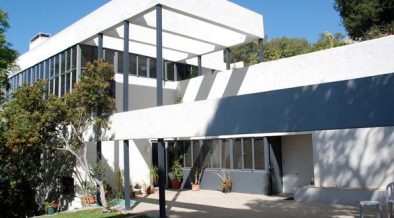
Written in 1962, A Clockwork Orange leans heavily on the graphic and architectural language of the 1960s. Clean lines, bold geometric patterns, and sculptural furniture dominate the interiors. Critics have long noted that Kubrick used these sharp, ordered forms to create a sense of psychological discomfort. The precision of the spaces mirrors the film’s obsession with control (social, moral, and institutional) making the environments feel rigid, cold, and quietly oppressive.
Many of the film’s interiors were shot in real locations across London and the surrounding areas, spaces that embodied the ambitions of post-war modernism. Brutalist housing estates, such as Thamesmead South, appear throughout the film, their raw concrete forms reflecting the era’s belief in rational planning and social engineering. These environments, originally designed to represent progress and improved living standards, take on a colder, more authoritarian tone within the film’s narrative.
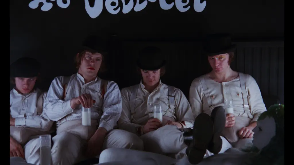
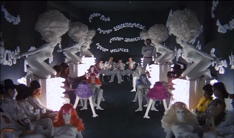
Interior spaces are equally rooted in mid-century design language. The Korova Milk Bar, perhaps the most iconic set, combines Pop Art, late modernist furniture, and sculptural form. The white fiberglass seating, shaped like stylised human figures, was designed by artist Liz Moore and reflects the era’s fascination with the body as both form and object. While mid-century designers often celebrated organic shapes and new materials, Kubrick exaggerates these ideas until they become uncomfortable, exposing the fine line between innovation and dehumanisation.

Throughout the film, furniture and décor echo the work of designers such as Verner Panton and Eero Saarinen, whose sculptural, futuristic forms pushed mid-century modernism away from restraint and toward visual impact. Plastic materials, seamless surfaces, and bold silhouettes appear repeatedly, reinforcing a sense of artificiality. These choices reflect the late-modern shift toward mass production and synthetic materials, ideals that promised accessibility but often resulted in uniformity.
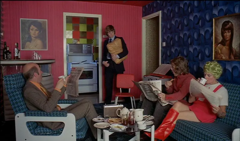
Graphic design also plays a crucial role. High-contrast geometric patterns, typographic wall graphics, and bold colour blocking appear across interiors, recalling the influence of Op Art and artists like Bridget Riley. These sharp visual rhythms disrupt the calm traditionally associated with mid-century interiors, creating optical tension and unease. Kubrick uses these elements to suggest a world governed by systems and control, where individuality is gradually eroded.
In A Clockwork Orange, mid-century design actively shapes how the viewer feels, guiding emotional responses as deliberately as the score or camera movement. Kubrick’s use of space, pattern, and form reminds us that design carries meaning, and that even the most familiar aesthetics can be transformed into powerful tools for storytelling.


