House Tour: A Mid-Century Modern Mix in Los Angeles
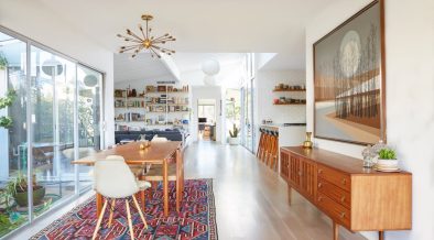
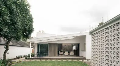
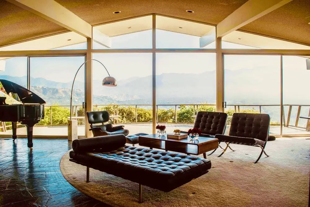
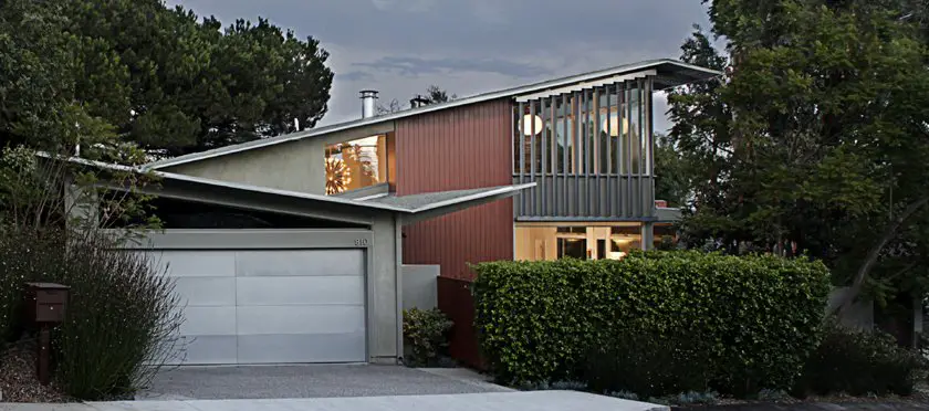
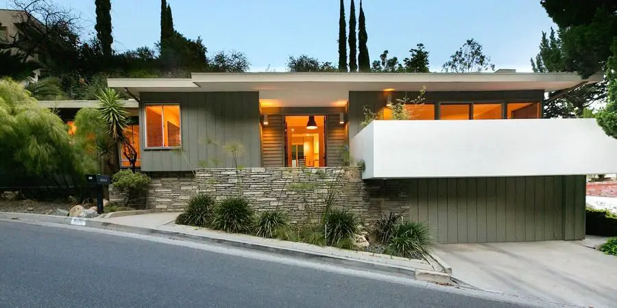
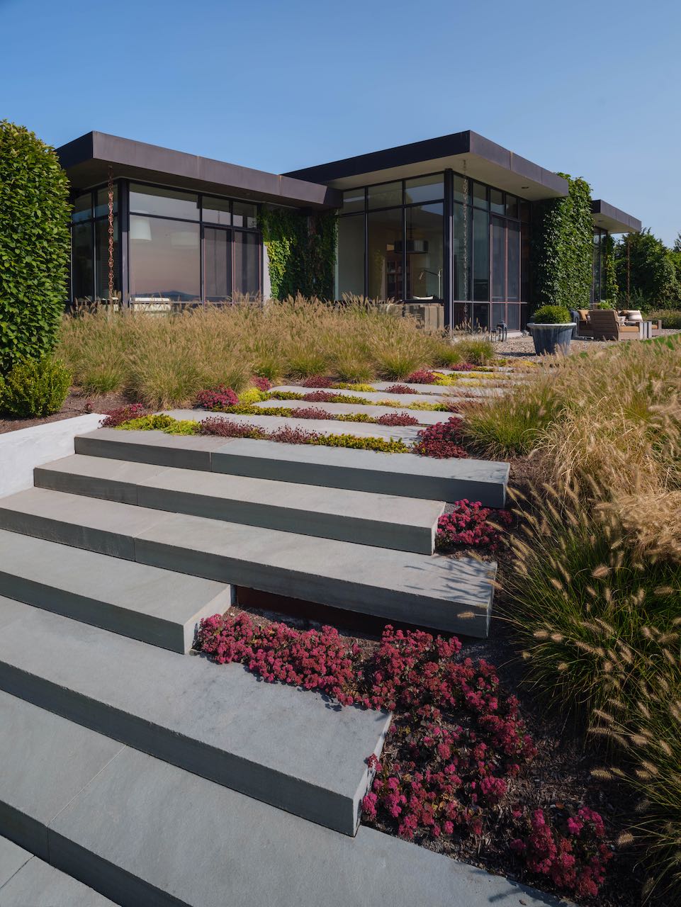
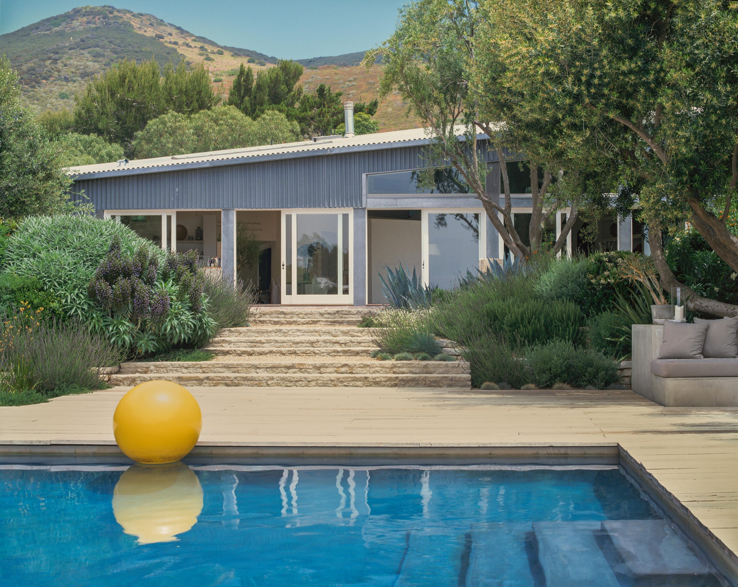
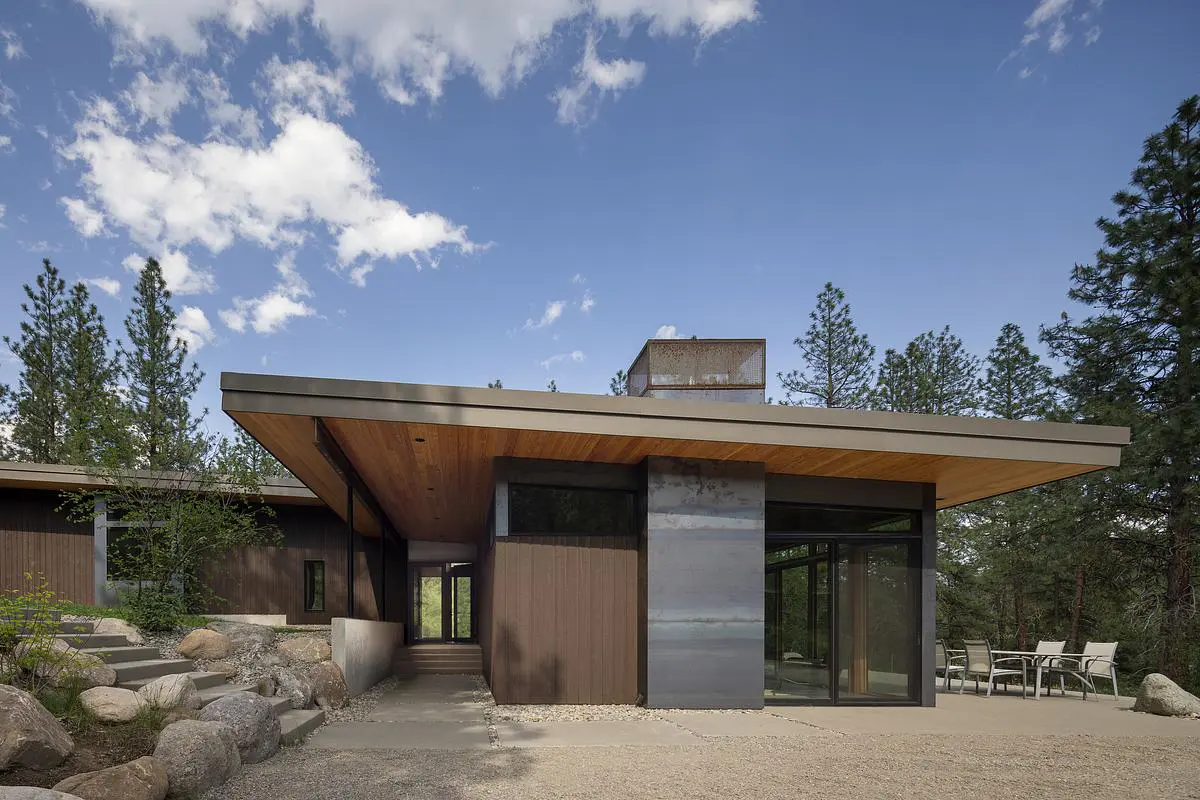
The perfect environment for mid-century modern furniture? Los Angeles, a bright mid-century modern house owned by a young couple.
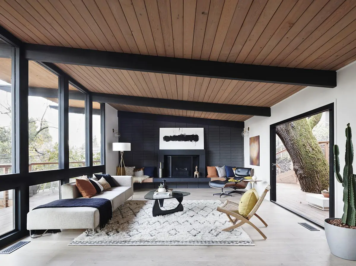
The classical mid-century modern decor elements are all there: big ceiling to floor door windows, flagstone covered walls, a fireplace that’s the real heart of the house  and wood panels. The perfect mix indeed…

More pics on apartmentherapy.
I’ve to be honest and say that there are few things I don’t like in the house so, this time, I want to ask you if and what you do not like of this mid-century modern interior decor. Let it me know in the comments!
Thanks for reading.


Gergeous place! They really need to start putting wet bars like that in homes again. No idea how they deal with all of that white upholstered seating though. It wouldn’t last 5 minutes here.
Come check us out at midcenturymidwest.blogspot.com
They probably take them out for photo-shoots only 😉
Thanks for stopping by and I will check your blog soon!
Ciao.
So simple, so beautiful, so chic 🙂
Beautiful indeed! Which is your favorite piece?
So slick!
I think there is too much white
They have lost some of the real contrast between light and dark in the walls, floors and ceilings of the apartment
I do agree…I like white but sometimes it gives an ‘hospital mood’ 🙂
I would have used a series of natural light tints instead.
I like the Eames management chair and the ambiance of the office. The white egg is pretty sweet with that great pillow, but it’s a great photo not a place to draw me in.
My favorite corner is the one with the small blu armchair together with the round side table and that amazing mirror.
Such a cozy and classy combination. 🙂
My favourite rooms: I love the home office. Awesome desk, and the colourful prints set it off just wonderfully. The black inspiration wall is a good idea, too. I also like the livingroom with the black furniture, some red accents in the decor (livingroom is the room with the dog; the room with white furniture is the family room). I like the ribbed glass door in one of the bathrooms: it opens the room up. Great house, some wonderful artwork.
However, I do find that there is too much white in some areas of the house. The white works better, imho, when there are other colours to ground it, such as the deeper-coloured wood in some of the rooms or the black furniture in the livingroom. I find the all-white palette of the dining room to be too stark, and the least successful room in the house… even though I absolutely adore George Nelson bubble lamps.
Wow! Thanks for the great comment! 🙂
Wonderfully crisp and always interesting!